Overview
Make learning history a fun expereience.
This is the documentation for our second project for Major Studio 1. Major Studio examines the fundamentals of digital product design, including user research techniques, production methods, wireframing, and prototyping. The project brief was rather simple: “build an app”. We decided to team up to combine our strengths and make a project that we couldn't have done by ourselves.
Duration
2 months.
Collaboration
Designer: Rachel Sun.
Developer: Rijk van Zanten
Researcher: Victoria Duong
Tools
Sketch/Adobe Photoshop/Illustrator
Project Background
Helping a non profit organization.
We quickly decided that we would want to focus our efforts on creating an app for a non-profit organization in the city. This “limitation” would give us a well defined scope and stakeholder to work with. Victoria came up with the idea to do something with Roosevelt Island. Having lived on the island herself for a little bit, she knew that there was a lot of history and things to explore on the island, but also realized that there aren't a lot of people actually coming to the island.
Research
About Roosevelt Island
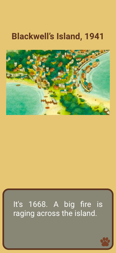
Roosevelt Island
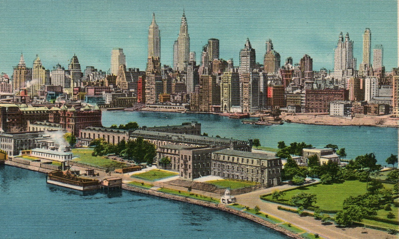
Roosevelt Island is a narrow island in New York City's East River. It is located between Manhattan Island and the borough of Queens. It is politically part of the borough of Manhattan. Running from the equivalent of East 46th to 85th Streets on Manhattan Island, it is about 2 miles long, with a maximum width of 800 feet.
— Wikipedia
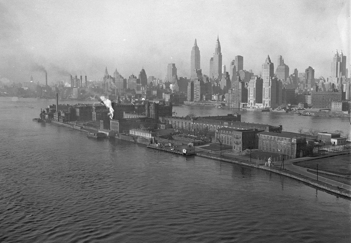
Roosevelt Island has a very rich history. In 1637, the island was bought by a Dutch governor from the Canarsie Indians. The island changed hands after the British took over in 1666. Two decades later, the island was inherited by the Blackwell family. In 1825, New York City bought the island after which a whole lot went down. The city needed a place to keep prisoners and other folks deemed “unfit” for the city; Blackwell's island seemed like the perfect place. The city erected numerous hospitals, a penitentiary, and an insane asylum on the island. People who were sent to the island seldom returned.
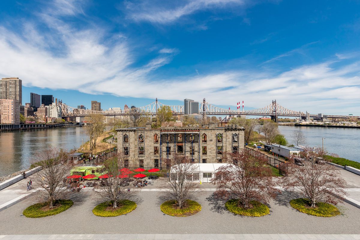
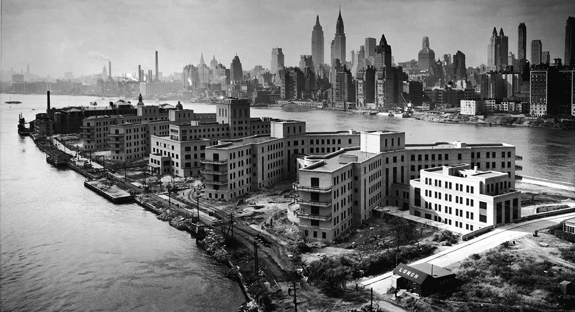 Even though the island has a very eerie history, there isn't much of that “darkness” left on the island today. It has turned in to a sprawling urban center filled with modern developments. Relics of the old days are still visible between the glass and steel that has been built since.
Roosevelt Island Historic Society
We found an organization that promotes awareness of the island's unique story and pursues preservation of its landmarks and artifacts. We reached out to the organization to see if we could schedule an interview to learn more about the island and the activities the organization is responsible for, but unfortunately they stopped responding. We decided to persevere and move on with the idea, as we'd become fascinated with the island and its rich history.
 The purpose of the Society is to recover, maintain, and disseminate the record of Roosevelt Island’s heritage from Colonial times to the present. The Society aims to achieve these goals as follows:
By collecting artifacts, documents, publications, photographs, prints, and other media recording the history of the island and its inhabitants. By maintaining those collections and making them accessible to the public. By conducting educational programs including tours, lectures, exhibitions, and publications.
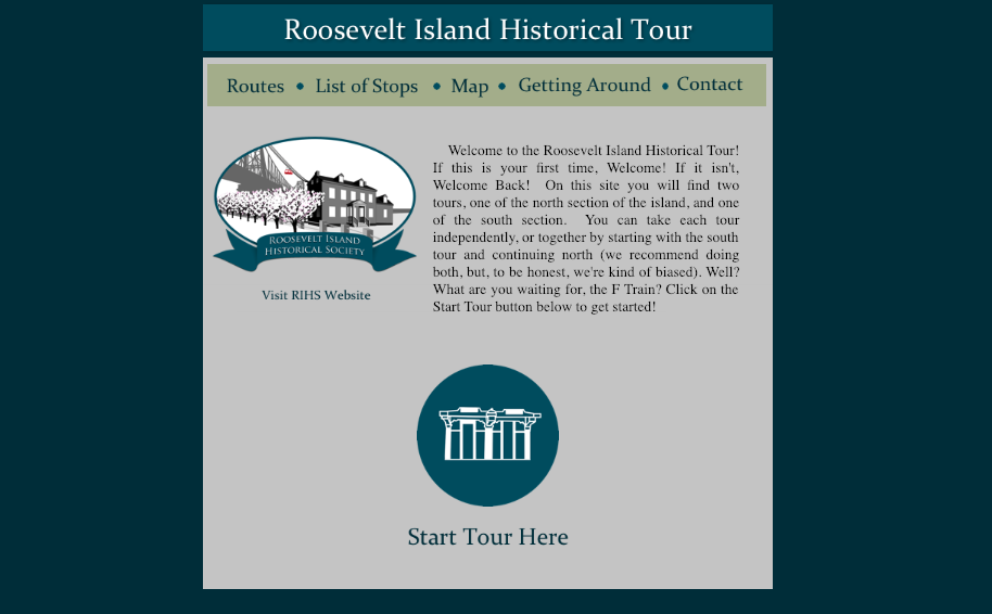
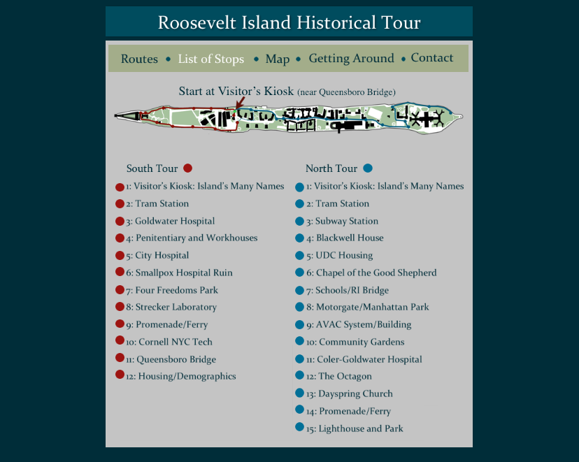
The RIHS has an existing walking tour available on their website. While the content of the walking tour is pretty comprehensive, there was a lot that could be improved upon in terms of usability and design. The tour wasn't optimized for mobile use. Although they have an app, it is clearly meant to be used before you go to the island as it does not work during the actual walk. We decided to turn this into our project.
The current Historical Tour on the Island is on a website. The website is very hard to navigate to and it has very little exposure. The tour has two different paths: South Tour and North Tour. Each path has different stops, which you can learn about through their website. However the website doesn't really work on mobile.
We learn that the website has detailed information of each location. It describes the important events and images of different time periods.
On Site Research
Visiting Roosevelt Island
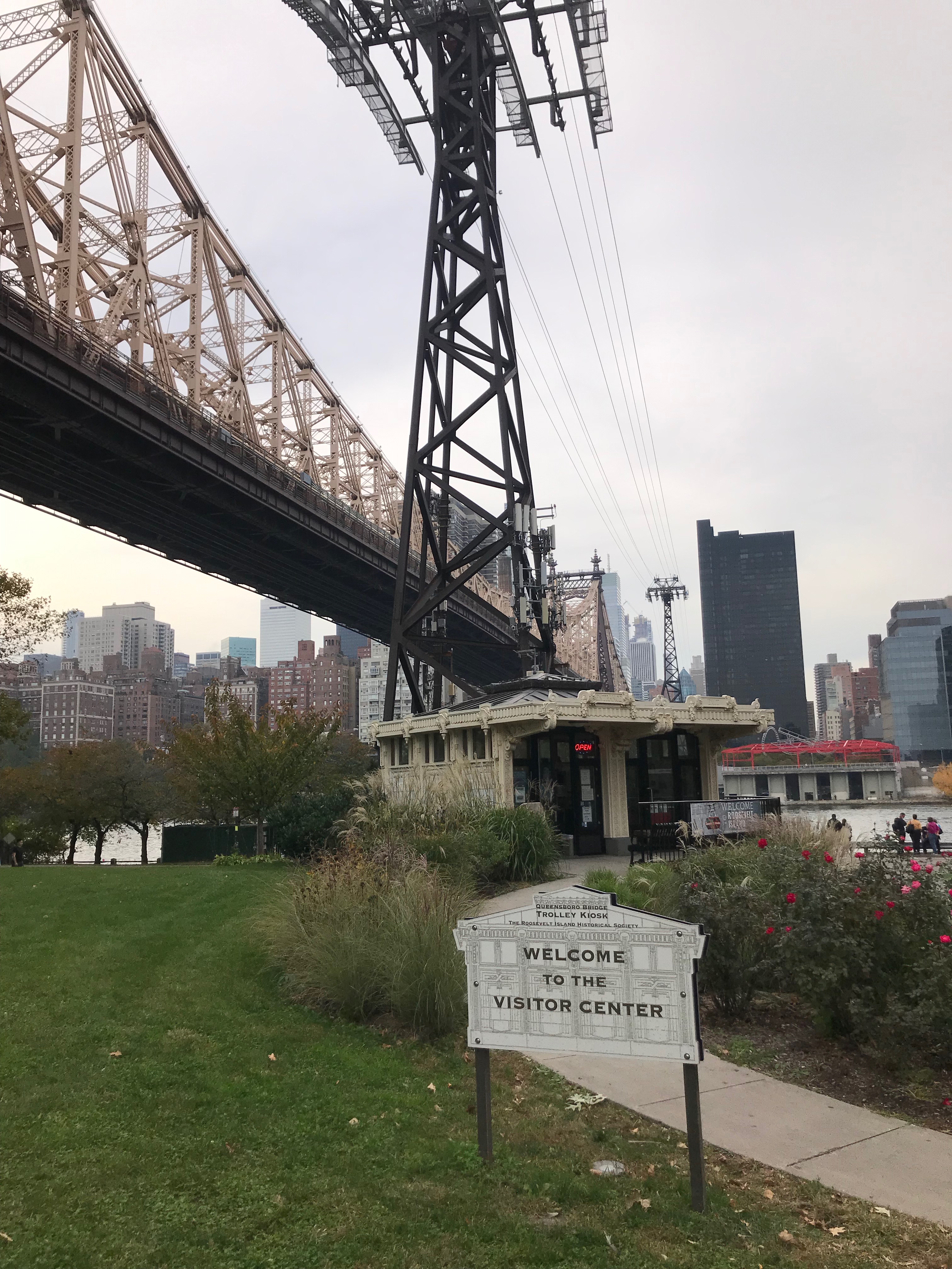
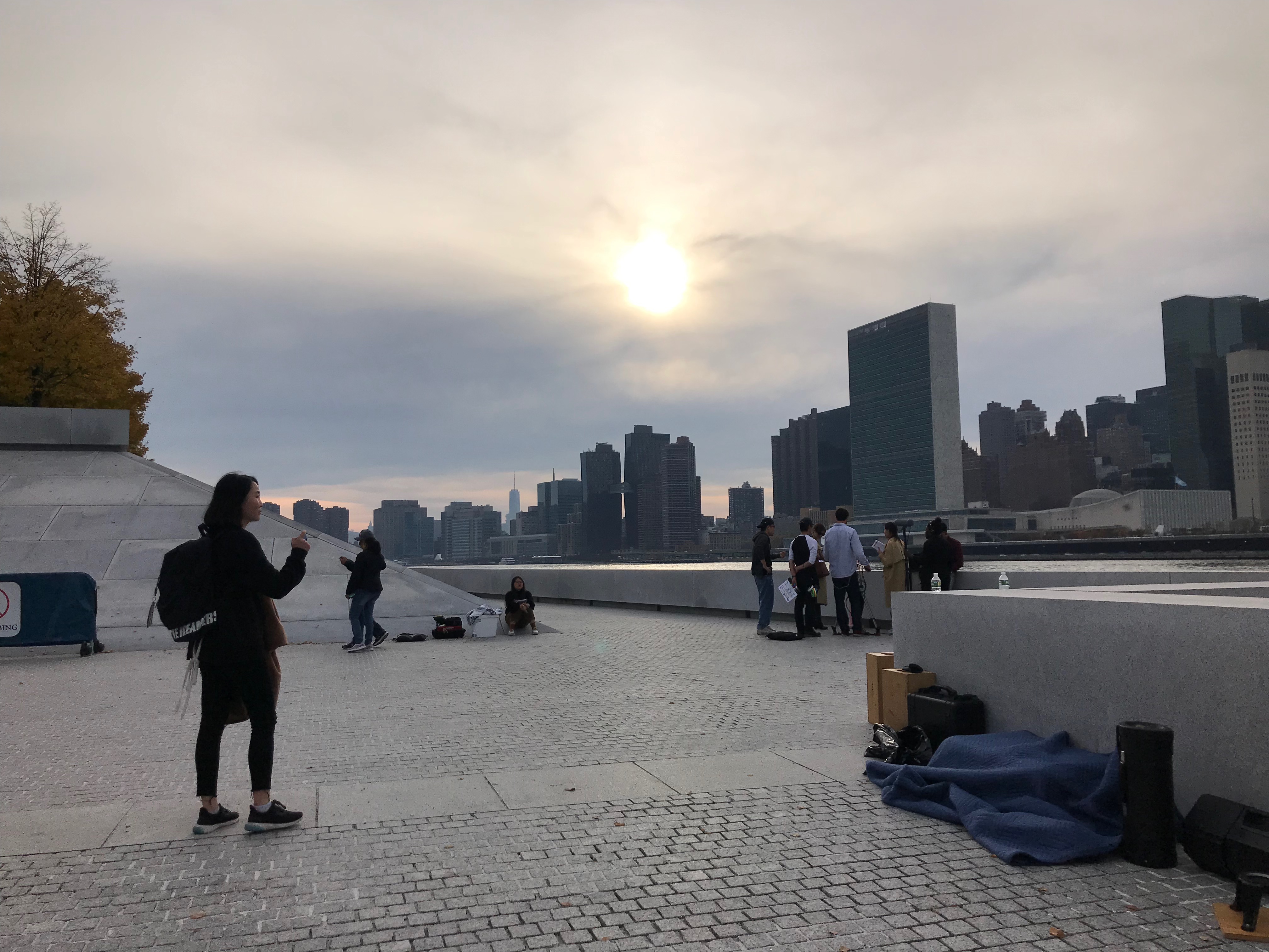
We visited the island as a group to check out the RIHS' Visitor Center and the different landmarks -- mainly preserved buildings from the island's past. We noted the different stops that visitors would be interested in seeing and the best route for getting to each stop.
We spoke to a few people at the island; some were out-of-state visitors and some were residents of the island.
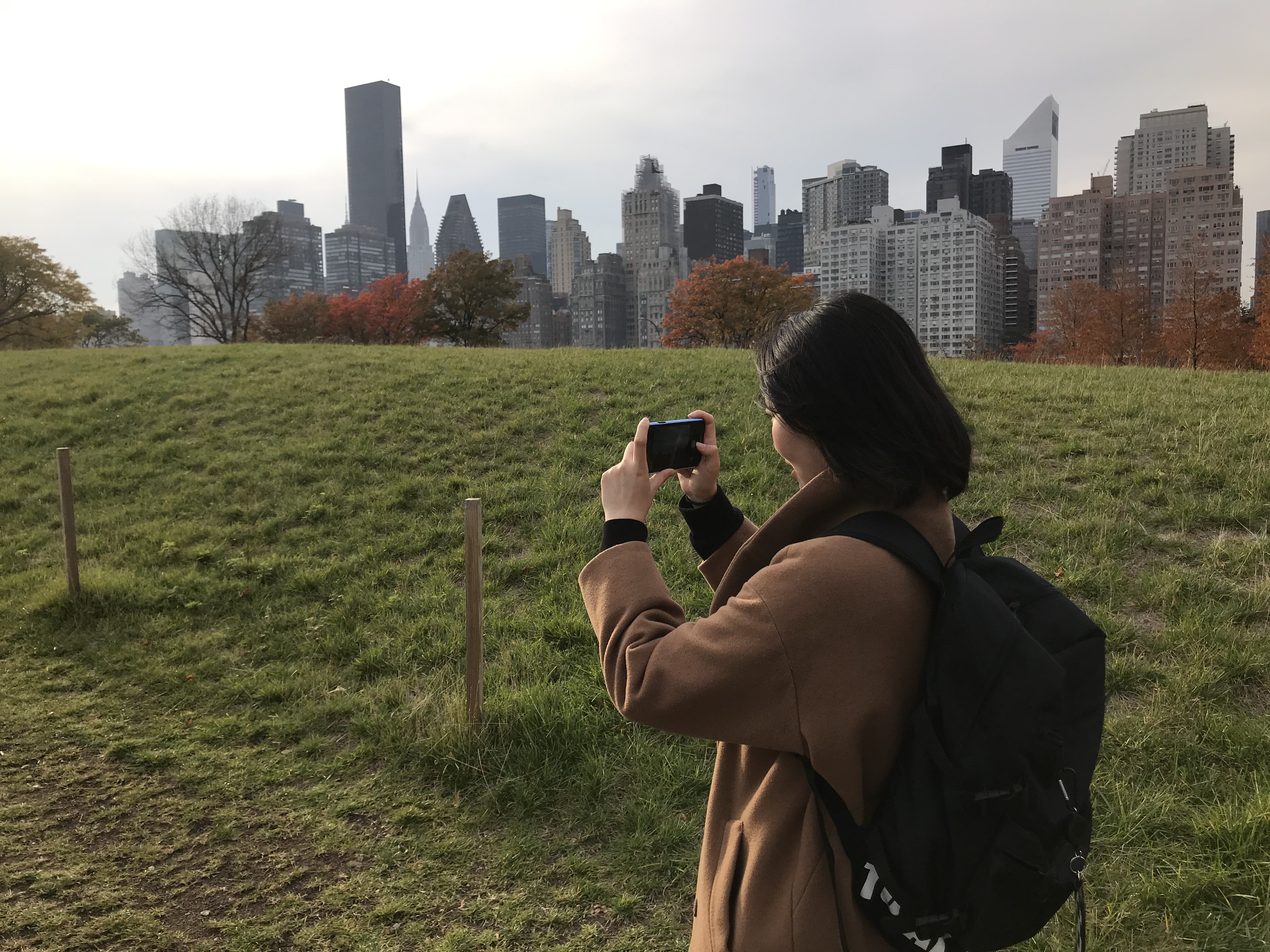
Roosevelt Island has a rich history but doesn't have a lot of people coming to the island to check it out.
Design Challenge
After our research phase. We came up with a design question:
How might we create a better experience for people to learn about the history of Roosevelt Island?
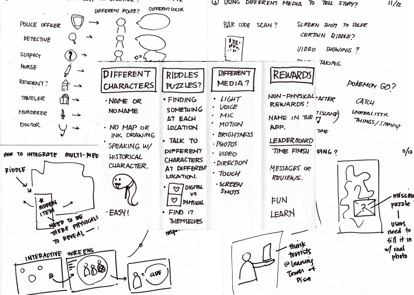
Brainstorming
Thinking outside of the box.
After our research, we started to define our insights, and we started to brainstorm what the possible solutions could be for the problem. We seperated the brainstorming into 1 minute per section, and each section we had different questions to finitely explore our thoughts. We want to explore outside the idea of a traditional touring application.
Concept
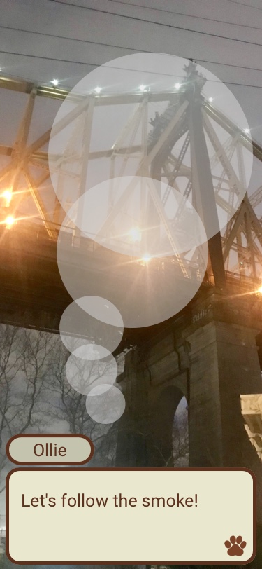
Learning history through an interactive roleplay game.
We believe in the power of storytelling. The idea we agreed on is to create a story where the users can play along while visiting the island. You follow a character, who is a guide that helps you throughout your experience.
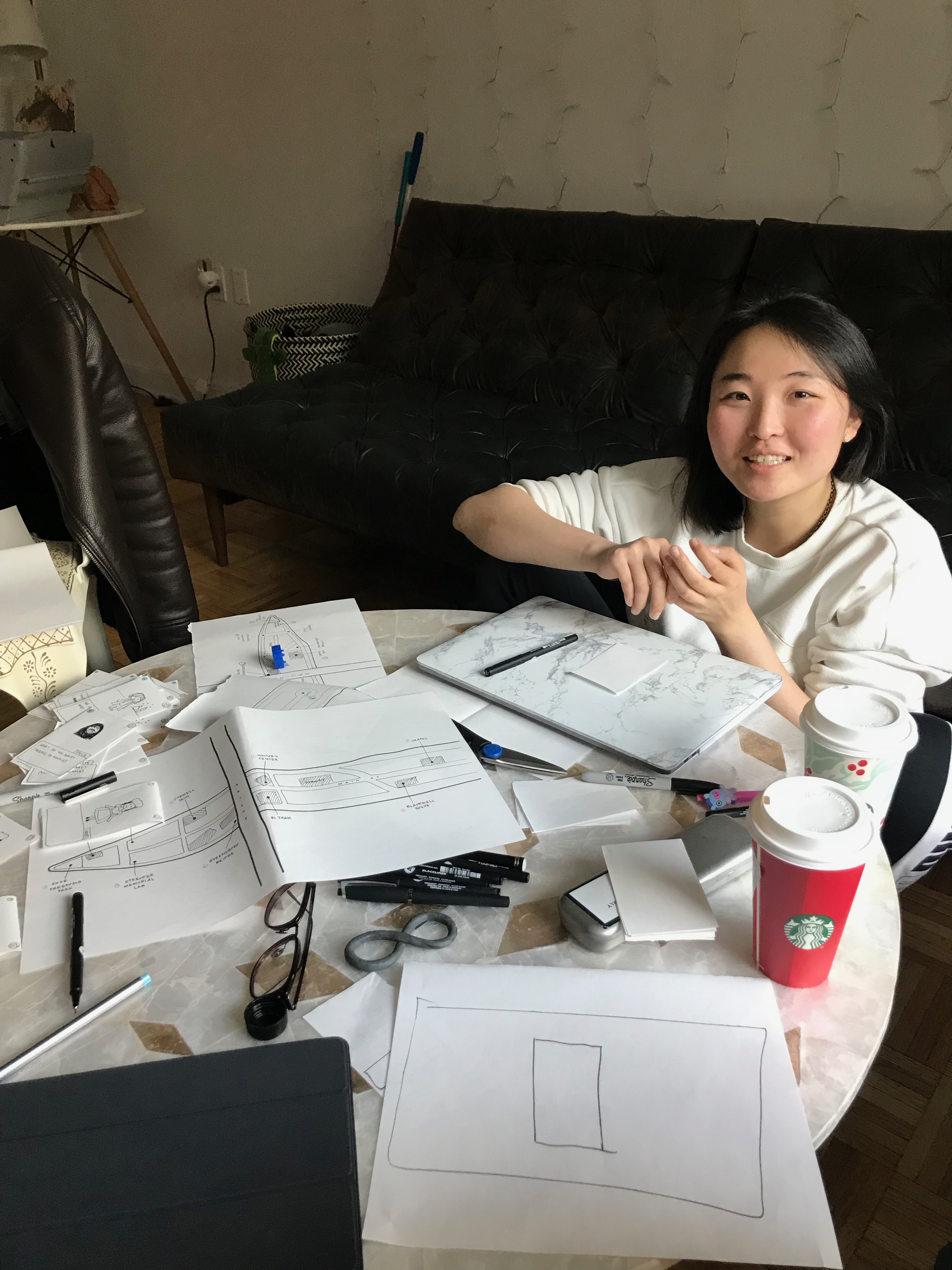
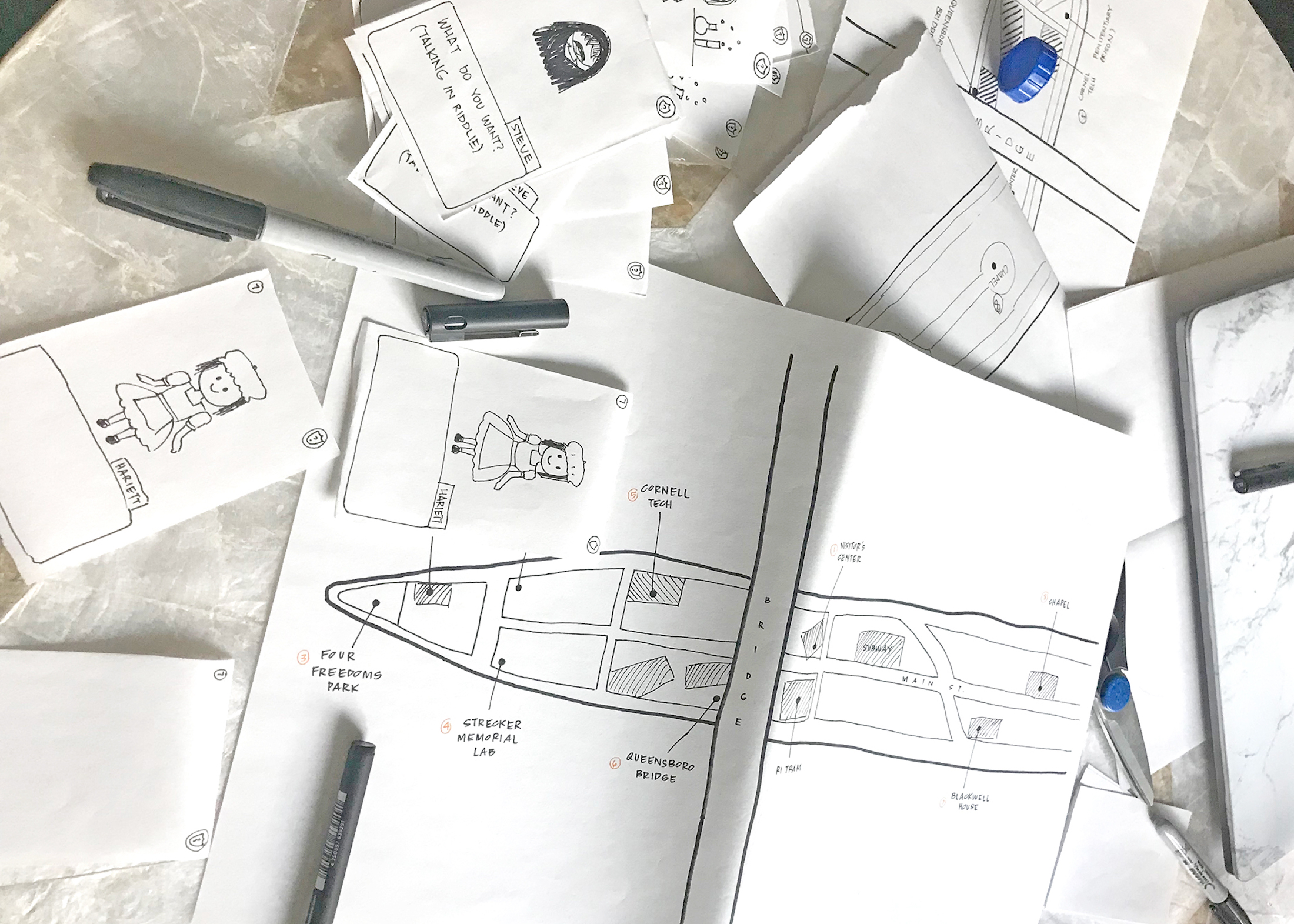
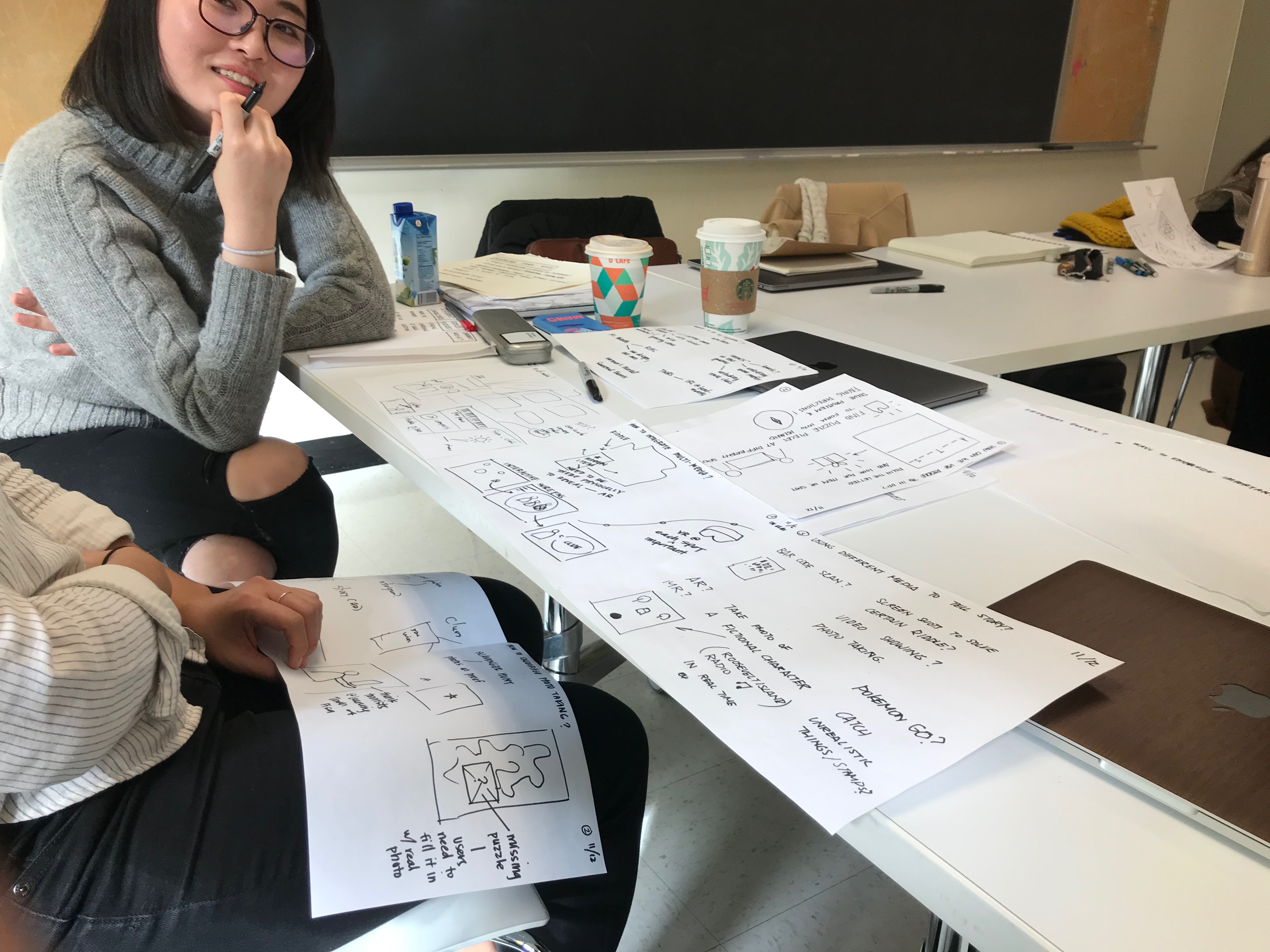
Paper Prototype
Testing out the experience and user flow of the storyline.
We create a portable paper prototype because it enables us to test our concepts and the general features of the application with multiple users without having them be at the island physically. The paper prototype consists of a map of the island with the stops marked and cards representing the different screens users can see on their smartphones.
Testing
We test the paper prototype on 4 different users. Below are some key quotes:
- “This is an interesting way to learn about the history of Roosevelt Island. But what would happen if I can’t figure out the puzzles?”
- “This will be a fun game to play as a family. I think the challenges will keep my kid engaged for a while.”
- “It is a little difficult to imagine how the AR will work in the application. But I get the idea of walking around while playing the game.”
- “I am a big fan of Pokemon Go. I like the idea of being able to travel to a new place with an interactive game.”
In general, the users really liked the concept of learning the history of RI through an interactive walking tour and game. Not only would they feel motivated to be active, the challenges and narrative will encourage their continued engagement with the application.
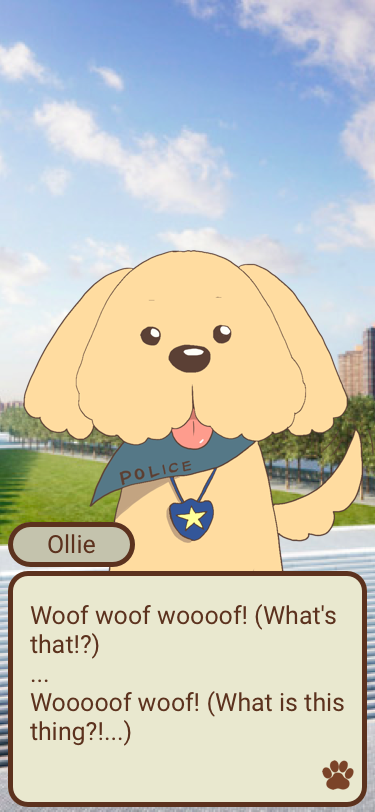
 One of the users was concerned about the difficulty of the puzzles, so we decided to include a "help" button on each screen and designate Ollie as a guide. Another user had trouble imagining how the AR would work, but this is just a restriction of paper prototypes; it should not be a problem in the hi-fi prototype.
Visual Languange
Historical, mystory and friendly.
The goal of our visual design is to create a fun and antique presence.
Moodboard
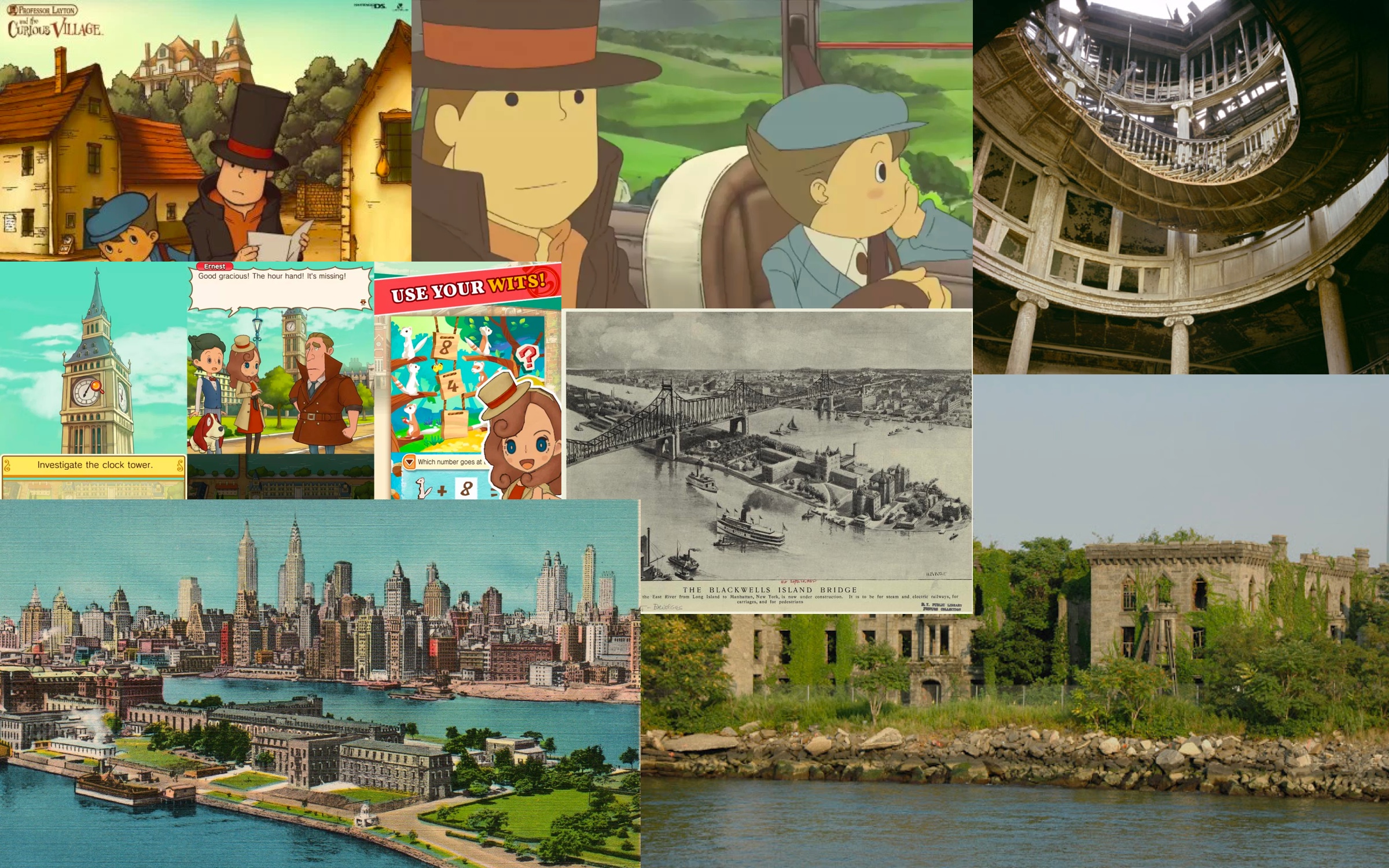
Throughout the tests using our paper prototype, we realize that this game could potentially be fun to play with children. We want to put in cartoon illustrations and old-style elements into the design. We are inspired by the game Professor Layton, which is a game on Nintendo 3Ds now available in the app store. The game has fun and a mystical story in its design that we also want to capture.
Color Palette & Typography
Our color palette is chosen based on the mood-board we created. We wanted to use more than 5 colors because the design has a lot of illustration elements in it. The colors also have a yellow ash overlay, because this will add an old feeling to the palette.
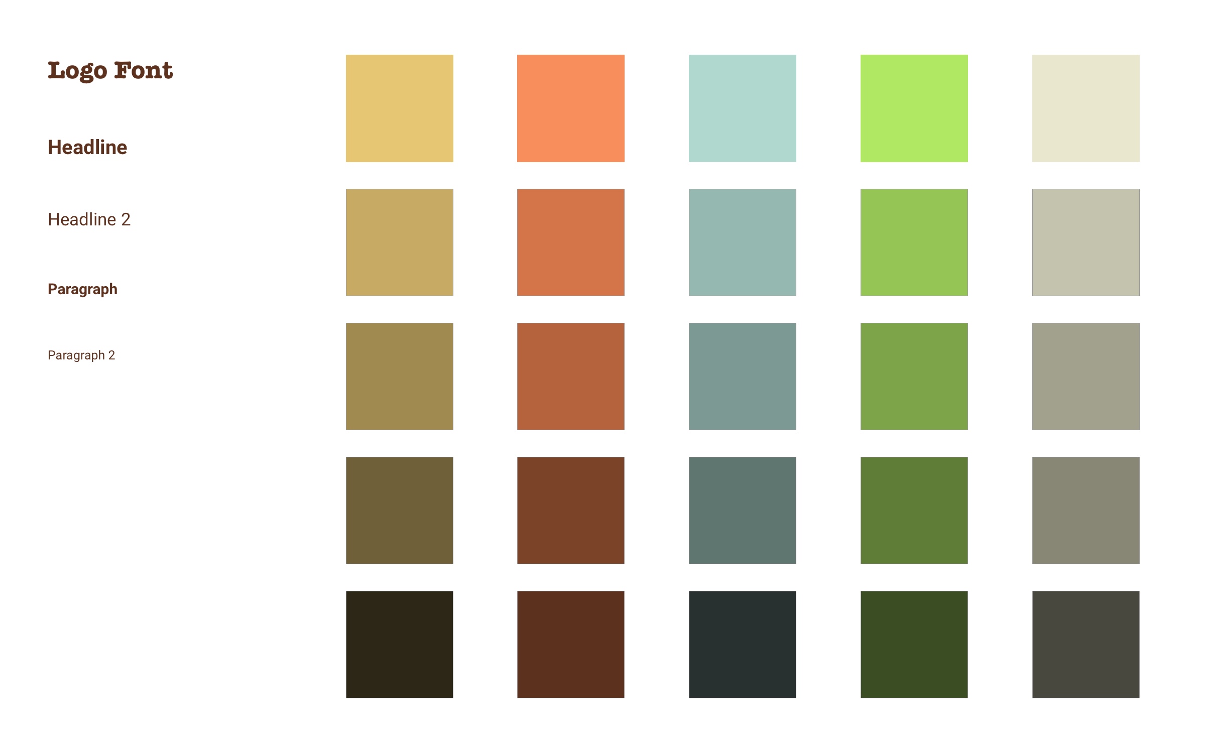
We mainly have three typography elements. The logo typography we use are Poppins and American Typewritter. The typography Poppins has rounded corners in the design. It reflects a feeling of friendliness and an impression of being welcomed in. On the other hand, the typography American Typewriter has an old and historical feeling. The third typography we use is Roboto. This type is used through out the entire application. The reason we choose Roboto the most is because it is a flexible and easy to read typography, while still being fun. It is clearly readable in both paragraphs and titles.
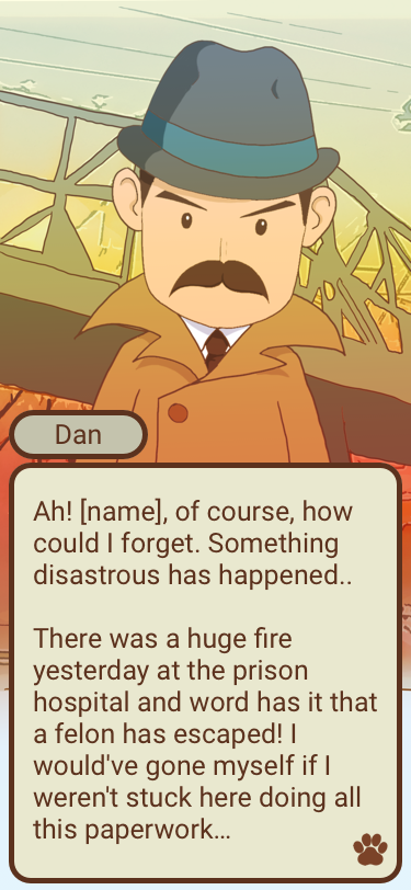
Characters
 (1).jpg)
.jpg)
The idea is to have multiple characters at different historical checkpoints. Each character will lead and give hints for the mystery on the island. The user's goal is to solve the mystery while walking around the island, engaging with the present and the past.
Final Prototype
Hi-Fi
Concept Video
Expressing the concept
Ultimately, we decided to shoot a video to best express the concept of our application. The reason why we made this choice is because it is difficult to create a fully functioning prototype due to the AR element of the application. A video allows us to effectively present our concept in a comprehensive and accurate way.